Saturday, September 30, 2023

QlikView Metadata Extraction

 Post Index

2023-09-30


QlikView Metadata Extraction

Automated Metadata Extraction


QlikView was a very good product in analytics.  It has been developing so well and now is going to fade out in the market.  QlikView is now having very few updates and minimal support.  A lot of companies are planning to migrate QlikView applications to Qlik Sense applications or other analytic tools like Tableau or PowerBI.

In order to perform the migration, apparently, it is not an apple-to-apple.  No matter on design or the end-to-end data flow, there will be differences.  Thus, to increase the successful conversion, there is a need to extract the metadata in QlikView.  Instead of browsing all details in the QV applications, extracting the metadata will make it easier to understand the applications and design.

This article is going to share the automatic method to extract the metadata.   And I will also share some ideas on how to use this metadata.


QlikView COM API

In QlikView, there are a tool called QlikView COM API.  It is available to be used for automation and macros.  It can also be used in creating standalone Windows applications with its OCX component.  The QlikView COM API reference can be found here.

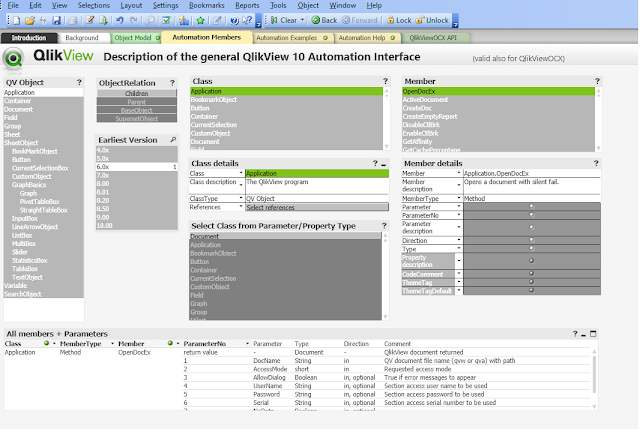
After downloading and unzip, there is a QVW application to illustrate all the API available.


Important Metadata

In general, two kinds of metadata are required:

1. Layout file

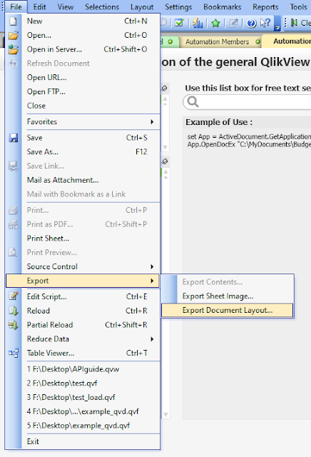
It contains all the QV properties in the application.  Apart from calling API, in fact, this can also be extracted via the front-end (* this will separate all individual components per XML file)


2. Variables

There are plenty of ways to extract variables.  For example, people might write script to get the values of each variables and put into a table, then export the details into csv.  In order to from metadata level, API can be used.


With both the XMLs and variables, it is very easy to trace the expression used in each chart.  And further analysis can be done to review how they can be implemented in other analytic tools.


In the QlikView COM API Guide application, there is a sheet named "Automation Members" to review the parameters of each method.


And there is a sheet "Automation Examples" that illustrates an example of the API call.


Using the QlikView COM API

The metadata extraction pseudo steps are described as below.

1. Define the paths, e.g. QV doc path, layout folder path, variables.csv path.

2. Create the QlikView object.

3. Open the QV document.

4. Export the layout files.

5. Get the variable list

6. Loop through the variable list and construct a format for csv output

7. Close and clean up the resources.


In order to use the API, VB script can be used.  The complete VB script is as follow.


'Paths

dim qvDocName, layoutFilePath

qvDocName= "D:\qv.qvw"

layoutFilePath= "D:\layout\layout.xml"

variableCSVPath= "D:\variables.csv"


'Create QV object

set qv = CreateObject("QlikTech.QlikView")

'Open QV doc

set qvDoc = qv.OpenDocEx (qvDocName, 2 , false , "" , "", "" , false)

' Export Layout Files

qvDoc.ExportLayoutFile(layoutFilePath)

' For variable CSV output

Set objFSO = CreateObject("Scripting.FileSystemObject")

CONST ForWriting = 2


'Open the CSV file for writing

Set objTextFile = objFSO.OpenTextFile (variableCSVPath, ForWriting, True, -1)


'CSV header line

objTextFile.WriteLine("VariableName|||VariableValue|||RawVariableValue|||")


Set vars = qvDoc.GetVariableDescriptions

for i = 0 to vars.Count - 1

set v = vars.Item(i)

        ' using ||| as delimit will be easier to avoid the newline and quote issues in CSV during read.

        objTextFile.WriteLine(v.Name &" |||")

        objTextFile.WriteLine(qvDoc.GetVariable(v.Name).GetContent.String &" |||")

        objTextFile.WriteLine(v.RawValue &" |||")

next

objTextFile.Close

qvDoc.CloseDoc

qv.Quit


Parsing the XML and Variables

The XML is well formatted and it contains all the properties of all charts, sheets, texts, etc.  To be simple, the most important are charts, dimension and measures.  By extracting these from the XML, it can have a basic ideas of the complexity of the application.

Usually, in the expression, a lot of variables will be used and more often, they are nested.  It is not easy to trace them level by level because there is a lot of back-and-forth to review each step.  In QlikView, dollar sign expansion is used to get the value of the variables.  With this understanding, it is possible to use $(variablesName) as a mapping to match the value from the variable list extracted.   In such a way, the variable used in each chart can be expressed in the most detailed format where all variables are extracted.

Although this cannot resolve dynamic variables, to certain extent, it helps a lot in digesting the information in QV.  This article would not cover the extraction part.  But in case if you think it is interesting, do drop me a message and I will see if a guide can be provided later.


Thank you for reading.  I hope you like the sharing.  Leave me message and let me know what you think.


Saturday, September 23, 2023

Analytical Calendar - Technical Discussion

Post Index

2023-09-23


Analytical Calendar

Technical Discussion


Analytical Calendar is extremely useful to be used in interactive dashboard.  I have shared a number of articles related to this topic and hope that everyone can understand the ease and the difficulty when dealing with date and calendar.  Different people might have different perceptions on how to use date and calendar.  It is impossible to change the mind if it is already becoming a habit or get used into the same regular actions reacting daily.  However, it is worth that you can try and understand further of what Analytical Calendar is and how it can make a difference in your analytic dashboards.

This article focuses on the technical design of analytical calendar and let you understand how it can make your life easier from the development and also from your daily use in analytics.  One of the nice stuff is that the date associations are already built inside the Qlik associative data model.  For developer, you don't need to work out a lot of set analysis to come up with the correct period.  For analyst, you don't need to work have a lot of charts developed and the perspective for period is simplified into analysis and comparison periods.

If you are not familiar with Qlik associative data model, please try to get some understanding in the Qlik website first.  Also if you have forgotten how to use the Analytical Calendar, please review in the previous post.  Or if you have interested in how the analytical calendar comes up, you can click the link at the top to follow the story.


Analytical Calendar Data Model

First, let's look at the data model of the Analytical Calendar.


Analytical Calendar consists of five core tables.  As shown in the above data model diagram, they include:

1. ANALYSIS_CALENDAR

This is the analysis calendar.  It controls the selection of "Date Perspective", "Unique Date" and "Analysis Perspective".  The main purpose of this table is to allow selection of analysis period.


2. %CUSTOM_LINKEDTABLE

It is a linked table to associate the ANALYSIS_CALENDAR to the PERSPECTIVE_CONTROL_CALENDAR.  This table exists because of the need of Custom Unique Date selection as a comparison.  Each analysis period, in fact, is associating a number of available comparisons.


3. PERSPECTIVE_CONTROL_CALENDAR

It controls the "Comparison Perspective" selection and it is also used to associate to the date range required in %DATE_RANGE_LINKEDTABLE.  Each row is associating to a corresponding date range (i.e. %DATE_RANGE_KEY).  This is a very important table because it has all date and calendar information, i.e. ANALYSIS, COMPARISON, CUSTOM.


4. %DATE_RANGE_LINKEDTABLE

It is associated a date range to the dates in the range.


5. DIM_CALENDAR

It is the dimension table of calendar to facilitate all the chart requirements on date and calendar.  It has all combination of date components and the corresponding sequence.


There is a TRANSCATION table that is a dummy fact table for demonstration purpose only.


More on the Technical Design 

There are a couple of "magic" lightened up the Analytical Calendar.


Analysis is a subset of Comparison

If you are small-hearted, you will notice the relationship between analysis and comparison in Analytical Calendar .  To do analysis, you need to select

1. Date Perspective

2. Unique Date

3. Analysis Perspective

To do comparison calendar, you need an additionally Comparison Perspective.  in other word, you must first have the analysis before you can do the comparison.  So, there are tables ANALYSIS_CALENDAR, %CUSTOM_LINKEDTABLE and PERSPECTIVE_CONTROL_CALENDAR in the design to allow each analysis period to associate with all possible comparison periods, either comparison range or Custom Unique Date.

Taking an example of analysis period MONTH, 2023-Mar, YTM.  It is associating with all comparison like 1 year before, 2 years before and so on, and Customer Unique Date like 2023-Jan, 2023-Feb, etc.  This kind of association is built inside the data model.

From another point of view, in term of data-wise, it looks like analysis is a subset of comparison in terms of the required selections.


Generic Keys for Custom Unique Date Association

Interestingly, there is a table called %CUSTOM_LINKEDTABLE.  Originally, the ANALYSIS_CALENDAR can directly associated to PERSPECTIVE_CONTROL_CALENDAR.  In order to allow Custom Unique Date selections, this table is using the concept of generic key.  Thus, all Custom Unique Date can be associated to any analysis period in ANALYSIS_CALENDAR.

If Custom Unique Date is not required, this table is apparently not required.


Magic %CONTROL_PERSPECTIVE

The %CONTROL_PERSPECTIVE is, indeed, the main control of which period to be applied.  If no value is selected in this field, it means all analysis and all comparison.  If "ANALYSIS" is selected, it means to enable analysis perspective but apparently, "Comparison Perspective" must be ignored, i.e. {<%CONTROL_PERSPECTIVE={'ANALYSIS'}, "Comparison Perspective"=>}.  On the other hand, to enable comparison, it needs to ignore ANALYSIS, i.e. {<%CONTROL_PERSPECTIVE-={'ANALYSIS'}>}.  Regarding to the selection in "Comparison Perspective", the corresponding date ranges are already associated.

You can think of a concatenation of Analysis Calendar, Comparison Calendar and Custom Calendar all into this table.   And %CONTROL_PERSPECTIVE is to control which one to be used.

This is the crucial part why the developer can have a very simple set analysis to control all kinds of date intelligent selections for analysis and comparison.


The use of % Fields and Tables

You might notice there are a lot of % fields.  All will be hidden after SET HidePrefix = '%' is applied.  The purpose is to make sure the end users would not be able to search and find the % fields and also the tables.  They are just for internal control of the Analytical Calendar and should not confuse the analysis or the experience in using the interactive dashboard.   Apparently, if you are very familiar with these, you can still let it show up in the interactive dashboard.


The Calendar Summary Text Box


The text box is an very important element in the overall design.  In terms of selection, human normally prefers to use date range representation while in terms of verification, it prefers a range of from and to date to verify.  With this principle, the textbox is not only showing both the selected values of analysis or comparison but also, the actual date range of the selected periods in analysis and comparison.  It is absolutely clear of what you select is what you get.


Because of the flexibility of Analysis Calendar, it also allows select discrete dates.  For analysis and comparison selection, there is no problem to show all selected values.  The only concern is the space available to show all.   But for the range, it is impossible to represent.  It, thus, flags up a keyword * Discrete to indicate the date range is not continuous.  However, this kind of usage is rare.


Conclusion

The design of the Analytical Calendar is a generic.  It does not limit to just include YTD, MTD, rolling, etc in analysis and comparison range in comparison.   There are many other possibility, e.g. Today, This Month, Last Month, Last Year, etc.   All kinds of date representation is able to be incorporated into the Analysis Perspective and Comparison Perspective.  Or there might be other kinds of usage that is not yet discovered.  As a short summary, it looks like date and calendar is simple but when you are dealing with them, you will find the mystery of it.  And throughout all the articles and discussions, I hope you all can re-think the best usage of it and not just stay in the traditional way.  The digital world needs a lot of new input and innovation to move forward.  Tiny things does not mean nothing but it is true that small things can also change the world.

Even though, the Analytical Calendar has been evolved for so many times, definitely, there are still things that can be improved.  If you have comments or ideas, please kindly leave a message below to discuss and let's see if it can come true for benefiting the digital world.


Thank you for reading.  I hope you enjoy the details shared.


Friday, September 8, 2023

Analytical Calendar - How to Use

Post Index

Technical DiscussionAnalytical Calendar The Story | The Index Page

2023-09-08

Analytical Calendar


Analytical Calendar is extremely useful to be used in interactive dashboard.  It is, in fact, having all the core components when manipulating date and calendar but it is re-designed to satisfy a more simplified way to benefit both the analysts and developers.

On the front-end, because of the simplicity to have just analysis perspective and comparison perspective, the presentation can be more consistent.  Instead of providing different charts for different date granularity, a single chart can already presented different period with different date granularity.  More details will be shared later in this article.

On the back-end, because now everything is already pre-calculated in the data model, it does not require complicated expression to be developed.  It greatly saves the effort for the developer.  More details will be shared later in this article.

In short, this article focuses on the demonstration of the analytical calendar to share the benefits of it.  And it also covers a bit on how it helps the analysts on selecting the date period with a few selections and how it helps developers to reduce the time and effort in design and development.

Let's start.

* this analytical calendar is a more enhanced version from my previous posts.

Two examples are shared in Github:

It is date level with complete week example and also with custom.

https://github.com/kongson-cheung/analytical-calendar/blob/main/Qlik%20Sense%20Analytical%20Calendar%20Examples/Analytical%20Calendar%205.0_Complete_Week_With_Custom.qvf

It is month level example.

https://github.com/kongson-cheung/analytical-calendar/blob/main/Qlik%20Sense%20Analytical%20Calendar%20Examples/Analytical%20Calendar%205.0_Month_Level.qvf


Analytical Calendar

Analytical calendar is a composite of tables associated together to provide time intelligent experience on usage and development.  It is a generic design that can be applied in different kinds of interactive dashboard.  The below will share the core component to let you understand how it can be used.  There are four main components required user selection including:

  • Date Perspective
  • Unique Date
  • Analysis Perspective
  • Comparison Perspective

Only selecting these 4 elements, it is allowed to perform time intelligent date range selection.


Date Perspective

It is uncommon that analysis is performing in different granularity levels.  Even if it is possible, it has a lot of assumptions to make it happen.  Defining a proper date granularity, it makes the overall analysis consistent and easier.  It named as Date Perspective to make it easier to understand by general users.


Date Perspective consists of only five values including Year, Quarter, Month, Week and Date.  It is to ensure the proper date granularity of the overall analysis and more technically, it is controlling the corresponding selection to comply with the integrity.  For example,


if Year is selected,
Unique Date: 2023, 2022, 2021, etc.
Analysis Perspective: Actual, Rolling 2 Years, etc.
Comparison Perspective: 1 Year before, 2 Year before, etc.


if Quarter is selected, 
Unique Date: 2023-Q3, 2023-Q2, etc.
Analysis Perspective: Actual, YTQ, Rolling 2 Quarters, etc.
Comparison Perspective: 1 Year before, 1 Quarter before, etc.


if Month is selected, 
Unique Date: 2023-Sep, 2023-Aug, etc.
Analysis Perspective: Actual, YTM, Rolling 2 Months, etc.
Comparison Perspective: 1 Year before, 1 Quarter before, 1 Month before, etc.


if Week is selected, 
Unique Date: 2023-W41, 2023-W40, etc.
Analysis Perspective: Actual, YTW, Rolling 2 Weeks, etc
Comparison Perspective: 1 Year before, 1 Week before, etc.


if Date is selected, 
Unique Date: 2023-09-09, 2023-09-08, etc.
Analysis Perspective: Actual, YTD, MYD, Rolling 2 Days, etc.
Comparison Perspective: 1 Year before, 1 Quarter before, 1 Month before, 1 Week before, 1 Day before, etc.


In any analysis, it is important to first define the date "perspective" for the analysis.  It avoids the chance to lose focus when manipulating the date components compared to the traditional design.


Unique Date

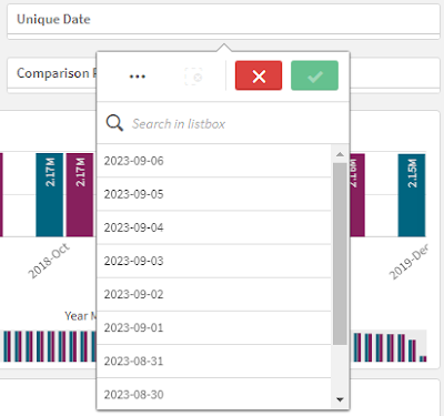
Unique Date is to further make clear the overall analysis in selecting the exact date representation in the specific date granularity.  

In traditional design, it requires to first select Year then Quarter or Month then to Day.  For developer, it is a disaster to determine the date granularity based on the selection.  A lot of rule-based calculation is required to be defined at the expression to manipulate the selection.  And because of this, this increases the chance to make multiple chart with the sake for different date level presentation.

For general users, it generates confusion, especially, in changing the selection or the view for the analysis.  It needs first to remove the selection and then to apply the new selection.  However, Year, Quarter, Month, Week, Day are conflicting with each other, e.g. if you select a month, you should not use week or vice versa.    If the selection is overridden, there is no mechanism to alleviate the proper selection.  All are just based on the human intelligence to rectify the date component selection.

Although for advanced users, it is definitely not a problem.  The analytical calendar design still hopes to alleviate this issue by making use of the unique date.


Unique date is a union of all the date representations by granularity of Year, Quarter, Month, Week and Date.

For example,

Year: 2023, 2022, 2021, etc.
Quarter: 2023-Q3, 2023-Q2, etc.
Month: 2023-Sep, 2023-Aug, etc.
Week: 2023-W41, 2023-W40, etc.
Date: 2023-09-09, 2023-09-08, etc.


In this design, it just requires to select the exact date representation directly.  There is no human interpretation and human computation required for the correct  and accurate selection.  In short, what you select is what you get.


Analysis Perspective

Analysis, in general, is always to deal a period.  A period means a start date and an end date in the same granularity level.  There are plenty kinds of representation available (to review), it looks the combination of a date plus the range type is more commonly used.  For example, 2023-09-09 YTD, 2023-06 Rolling 6 Months, etc, i.e. a unique date plus the date range type.  To be more precise, there is a date range type called Actual.  It represents itself.

Analysis perspective also follows strictly on the date integrity.  For example, Unique Date=2023, it does not allow you to select YTD, YTM, Rolling 5 months, etc.  Only if the valid combinations fallen into the same date granularity, it allows the value for selection.  In a lot of traditional design, this is not doing very well.


Comparison Perspective

Comparison is another important element in analysis.  Instead of just looking at the current performance, it also very common to compare the historical performance to see whether it is good or bad.

The most common way to represent comparison is last year, last month, or a specific date.  To make it more generic, it becomes last X Year, last X month or a custom date.  Custom date means any unique date.  It can be Year, Quarter, Month, Week or Date. 


In the implementation, it represents X Years before, X Quarters before, X Months before, X Weeks before and X Days before.  For custom date, it is a list of date representation similar to the Unique date.  Similarly, there is date integrity applied.   For example, if the 2023 Actual, it would not allow the selection of X Months before, X Weeks before because they are not in the valid granularity level.


Front-end Design Improvement


With the capability of the Analytical Calendar, the front-end now can be more neat and clean.  The reason is because there is only two perspectives for periods, i.e. Analysis period and Comparison period.

Analysis period is the period for analysis.  It is similar to the traditional design to select year, quarter, month, week and day.   Comparison period is the period for comparison.  In traditional design it is usually incorporated into the chart and each chart will represent a kind of comparison.

By making use of the Analytical Calendar, all charts now can be possible to provide either or both analysis and comparison period.  There is no need to replicate the same chart to have each to show individual Year, Month or Week, etc for the KPI and the comparison.  All charts are on-the-fly to provide the information based on the user selection.

In other words, it provide a coherent view in terms of usage and experience.  To further let the analysts understand what is being analyzed, on the top left corner, there is a textbox showing both the selection details as well as the actual date range selected.  In this way, it is crystal clear on what analysis is being performed and what comparison is being performed across from the selection to all the charts being shown in the sheet.


Back-end Design Improvement

In order to use the Analytical Calendar, it requires only two variables named vSetAnalysisAnalysisCalendar and vSetAnalysisComparisonCalendar.  The former is used for filtering the Analysis Perspective period while the latter is used for filtering the Comparison Perspective period.

The variable vSetAnalysisAnalysisCalendar is very simple as illustrated below.  It just requires to set the %CONTROL_PERSPECTIVE equals to ANALYSIS and make sure there is no Comparison Perspective.

Similarly, the variable vSetAnalysisComparisonCalendar is also very simple as illustrated below.  It just requires to ignore the %CONTROL_PERSPECTIVE equals to ANALYSIS.


With these two variables, all the expression in the chart development is straightforward.  It just needs to apply the set analysis for the two variables.  

When requiring Analysis Perspective, the below set analysis can be used.


When requiring Comparison Perspective, the below set analysis can be used.

As the front-end is now consistent and coherent, the same expression can be applied and across all the charts.  Unless, there are specific chart would be shown, these two kinds of expressions can satisfy a majority of the use cases.  Definitely, the Analytical Calendar can also be applied to more advanced use scenarios which would not cover here.


Other Advantages

Indeed, the Analytical Calendar also has other advantages.  In designing the data model, majority of the time would fall into a situation to pre-build a data or to calculate on the fly.  The rule of thumb is always to pre-build it if possible to minimize the computation required during use.

When manipulating date, there are also a few scenarios that might not be generic for every usage.  For example, if today is 2023-09-09, should it allow the selection of 2023-Sep?  In my experience, it depends on the flavor of the end users but this becomes a question of developers for a proper expression development.  Another example is the cross year week.  There are different ways to handle the incomplete week like making it full week and count as the previous year week or the let the week to be incomplete.  This is a headache not just to developer but also the analysts using the interactive dashboards.

Thus, the design of Analytical Calendar also incorporates this element.  It allows to pre-calculate all these into the data model and do not need very complicated on-the-fly expression to calculate the results.  It can still maintain as Analysis Perspective and Comparison Perspective.  The below are some scenarios for sharing.


This concludes how to use the Analytical Calendar.  Please leave me message if further discussion is needed.


Thank you for reading.  I hope it help you.  Just leave a message if you have any discussion/share want to make.