Saturday, February 15, 2025

Practice - Data Flow Practice

   Post Index

2025-02-15

Data Flow Practice

Generic Pattern for Reference and Discussion

In business analytic realm, it usually involves two core parts.  One is data transformation and the other is data visualization.  There are many terms for data transformation like data wrangling, data preparation, data processing, etc, no matter how it is called, it is a process to prepare the analytic data for visualization or presentation.

In a lot of the analytic teams, it involves tools to help transform the data and it takes the data sources into the tool and then perform a lot of data operations to generate and save the output to storage.  In which, the data flow is often a headache to many data analysts because it is not easy to write a maintainable flow.

In this article, it hopes to provide you some concepts about some important areas in data flow and let you understand the practice.  As the rapid change of the world, it does not cover everything but at least, it is a concept you might consider to follow.


Data Flow Process

In all the data flow, it has three main components involving:

  • Input
  • Preparation
  • Output


Input is a process to take in the necessary data into the tool for processing.  Necessary data means the required columns and required rows.   Required columns are columns that are required in the output or they are for making new derived columns.  Required rows refer to the relevant records.  For instance, rolling 4 years of data.  Input process is crucial to filter out irrelevancy because it helps the downstream processing to save resources by the means of not doing redundant operations.

Many data analysts do not pay much attention to this.  It is understood that while implementing the data flow, it keeps rapidly changing of the flow logics.  However, at the end, the redundant input should be tidied up.  Apparently, it is good for the system performance but it also increase the readability and maintainability.


Preparation is a process to prepare the necessary business data for the output.  It generally involves tasks like data cleansing, creating new columns for business purpose, joining / union, grouping, etc.  It could be a complicated process dependent on the analytic requirements.  More commonly, it is a process to prepare a data model for visualization tool.  The enterprise data is taking in and the business units are on top to generate new values for the data based on  their operation or analytic purposes.  Without a proper concept, it always leads into a messy flow which has low performance and low maintainability.  In fact, there is some steps that might consider for better flow.


Output is obvious a processing to save the data into the storage.  It also is a process to tidy up the data for the downstream usage.  Data flow because it helps the downstream to continue the flow for processing and generating data values.  The tidy-up process usually involves a column renaming.  For example, the columns are renamed from database naming convention to business naming convention to facilitate the visualization purpose.  Output is, in fact, the input of the other data flow / processing.  It should well understand both the up/down stream impact in order for the best data flow development.


Single Table Pattern

Let's take a simple case that the data flow only involves one table.

For all data operations, it starts with single table (* there are semi-structure data that is not in tabular format, the concept here is to deal with a single set of data initially).

When dealing with single table, it involves the generic steps as shown in the below diagram.


Let's break down into the three core components in data flow to explain what it actually does.

Input process, as discussed, brings in the necessary columns and rows.  It specifies column name and row filters.  No matter what kinds of data, it is the first rule of thumb to do to just bring in relevant data.

Preparation process is then to manipulate the brought-in data by formula or logics such as data cleansing (trim space, split text, change date format, etc), deriving new columns for business analysis, creating new join key (it happens when more tables are involved).  Once the required data processing is completed, the next step is to remove the irrelevant columns.  It means to only keep the columns that are required for the output.

Output process is then to rename all the relevant columns for the downstream usage.   More often, it applies the business naming convention.  Once it is completed, it will then write out the data to the target storage.

The pattern looks simple but in reality, you will see a lot of data flow is not achieving this simple practice.  The reason is understood that the rapid change of the requirement and data might be difficult to keep this practice.  However, indeed, if this practice is always maintained, it is far easier than not to apply it.  Once applied, the benefit is obvious that you feel more happy to read and digest the data flow details.


Two Table Pattern

Let's then take a another simple case of involving two tables.

When dealing with two tables, it involves the generic steps as shown in the below diagram.


Two tables mean two single tables.  Therefore, it follows the same practice for input and preparation processes for two single tables individually before it combines the data into the combined table.  In here, the single table should first complete all single table operations that means it finishes creating the new derived fields if it relies on only one single table data.  In such as way, the data flow is easier to track and trace.

Let then takes a closer look the combined table preparation process and output process.

Preparation process is actually the same as single table with an additional step to combine the data using join or union.  After combing the tables, it continues the data operations.  The data operations refers to the operations require columns in both tables.  Once completed, the irrelevant columns would be removed.

Output process is the same as the single table pattern that it rename the columns to facilitate downstream operations before saving out the data.

Again, the pattern looks simple but in reality, you will see a lot of data flow is not achieving this simple practice.  You can image that it is just a step by step process to first deal with merely a single table and then two tables.


Three Table Pattern

Three tables are apparently very similar to two tables.  It is the same that it first manages the single table and the combined table.  The only additional step is that it has two combined steps. 

The generic steps as shown in the below diagram.


It actually adds a step to combine the third table against the two combined table.  The general steps are same.  The concept is very clear to deal with one table and then two, then three and so on.

Sound easy and try to keep the flow clear.


Data Flow Design Pattern

The data flow design is actually simple if it is executed step by step with the concept.   The problem that is always faced is mixed up the steps.  The mix up of the order of steps could lead to unbelievable impact.

For example, the renaming happens in the middle of the flows.  It generates extra and untraceable data operations.  Or even, it leads to unnecessary and excessive renaming operations.  Firstly, it is difficult to find where the rename operations, second, it takes your brain to memorize the different naming convention for the same stuff.  The column name should be consistent from being to the end such that it is easy to trace and use.

Another example is the single table operation happens in the multiple table operations.  Yes, it works for the output.  But if you are considering more precisely and having a deeper thought, you will know that it wastes the resources.   Apparently, the combines table might have more data than a single table.  In terms of resources, it processes more rows for the same calculation.  Moreover, it also generates a sense why the operations happens there because there is no clue when the single table operation will take place.  It leads to difficulty in reading and maintain the flow.

Overall, the below diagram summarize the general steps as practice to deal with data flow.  Yes, data flow could be more complicated than this.  But please bear in mind that generically, it is simply these simple operations.  Isn't it?


Data Flow Optimization

Optimization is a not a must do task but it has big advantages in general to enterprise working on data flow.  Optimization actually is reducing the human readability because it helps optimize the data flow to facilitate the computer to run faster and more efficient.  It could not be hard to image that it helps save money because nowadays, every piece of cloud resources is actually money.

So, working on data flow, which is more important?  Human readability or computer efficiency?  The answer is obvious to strike the balance.   But frankly, it should first be human readable then computer runs efficiently because maintaining the data flow is human.   Unless, there is a very strong team that is very technical.  Otherwise, let's vote for human readability.  In the digitalization decades, more business users are actually starting to deal with data.  Even the skill sets are increasing for business users to deal with data, it is still far possibly they are more technical than IT specialists.  At least, for my personal experience, enabling the business units to get into the data world, the benefit is much more than having just a fast running flow.  Do you agree?


Thank you for reading.  I hope you can create a proper data mindset and continue the future data journey.  Just leave a message if you have any discussion/share want to make.

Saturday, November 30, 2024

Analytical Calendar - Feeling and Experiencing for Feedback

  Post Index

Technical Discussion | Analytical Calendar The Story | The Index Page

2024-10-30

Analytical Calendar

Feeling and Experiencing for Feedback

Analytical Calendar has been developing for quite some time.  And there are quite a number of enhancements evolved in the design and also improved algorithms to tackle all the date manipulation issues.  With feedback on developers and users, it evolves the way of doing analysis with the new ways of using calendar.

Today, I am going to share a couple of QVD files and also the Qlik Sense template application such that you are able to feel and experience the benefits of analytical calendar.  I have put the files into google drive to share and you are easily to use web file data connection to grab and use them directly or simply download into your drive and try it out.


Analytical Calendar Date and Month Level

There are three analytical calendars are going to share:

  1. Date Level - Complete Week
  2. Date Level - Incomplete Week
  3. Month Level
* The concept of complete and incomplete week, please refer to the previous post.


For date level, it covers 5 years of data with period from 2021-01-01 to 2025-12-31.  And it has the following analysis perspective and comparison perspective:
  • Analysis Perspective
    • Actual Year
    • Rolling Year (2 - 3 years)
    • Actual Quarter
    • Year to Quarter
    • Rolling Quarter (2 - 3 quarters)
    • Actual Month
    • Year to Month
    • Rolling Month (2 - 11 months)
    • Actual Week
    • Year to Week
    • Rolling Week (2 - 26 weeks)
    • Actual Date
    • Year to Date
    • Month to Date
    • Rolling Day (2 - 30 days)
  • Comparison Perspective
    • Comparison Year Before (1 - 3 years)
    • Comparison Quarter Before (1 - 3 quarters)
    • Comparison Month Before (1 - 11 months)
    • Comparison Week Before (1 - 26 weeks)
    • Comparison Day Before (1 - 30 days)
    • Comparison - N/A

For month level, it covers 5 years of data with period from 2021-Jan to 2025-Dec.  And it has the following analysis perspective and comparison perspective:
  • Analysis Perspective
    • Actual Year
    • Rolling Year (2 - 3 years)
    • Actual Quarter
    • Year to Quarter
    • Rolling Quarter (2 - 3 quarters)
    • Actual Month
    • Year to Month
    • Rolling Month (2 - 11 months)
  • Comparison Perspective
    • Comparison Year Before (1 - 3 years)
    • Comparison Quarter Before (1 - 3 quarters)
    • Comparison Month Before (1 - 11 months)
    • Comparison - N/A


Analytical Calendar QVD Files

The following are the shared files:


Analytical Calendar Qlik Sense Template

The three Qlik Sense templates are shared in my github.


How to use Web File

The Qlik Sense template is using the web file to directly load the calendar from my google drive.  Below is a brief guide on the step required.

1. First, in data load editor, right hand side, select "Create New Connection".


2. Then, select "Web file" under "Data Sources".


3. Then, enter the QVD URL (the QVD file mentioned above) and also a name for the data connection.


4. Then, a data connection is created.  Select the table to "select data".


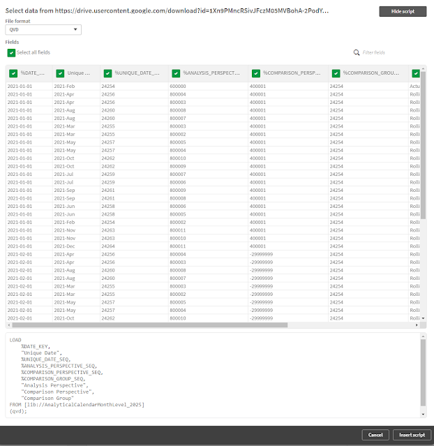
5. Then, it will load the data from the URL to preview.  And then select "Insert Script"


6. Then, the required script to load the data will be added.


7. Use the same steps for the two QVDs.
e.g.
  • AnalyticalCalendarMonthLevel_2025.qvd 
  • DimCalendarMonthLevel_2025.qvd


Thank you for reading.  I hope you enjoy using the analytical calendar.  Just leave a message if you have any discussion/share want to make.

Sunday, October 20, 2024

Analytical Calendar - New Update 2024-10-20

 Post Index

Technical Discussion | Analytical Calendar The Story | The Index Page

2024-10-19

Analytical Calendar

Analytical Calendar has been enhancing and it hopes to help analytics becoming simpler, more standard and allowing both developers and analytic users to take advantages over it for its generic and harmony design of using date for analysis and comparison.

For analytic users, it does not require to bear the burden of date manipulation because the selection and the visualization are already integrated very well together to bring along the effect of what you select is what you get.  Although, it needs to first understand the concept, it is fairly easy to ride on.

For developers, it does not require to write a number of expressions for different date requirements and avoids creating plenty of similar charts to achieve different date granularity to make overall design neat and focused.  The development is shortened so that more effort can be put into the visualization for best analytic purposes.


Today, this article focuses on the description of the new version of analytical calendar on two areas:

1. two tables design

2. comparison group is added


Two Tables Design Analytical Calendar

Analytical calendar has been enhancing along the time.   In the previous version, it requires 3 core fields to control over the analysis period and comparison period that includes:

  • Analysis Perspective
  • Unique Date
  • Comparison Perspective

These three fields intelligently help you deal with all complicated calculations in the backend and avoid confusion when dealing with impossible date component combinations.

In the previous design, it has three core tables:

  • Analytical Calendar (ANALYTICAL_CALENDAR)
  • Date Range Linked Table (DATE_RANGE_LINKED_TABLE)
  • Date Dimension (DIM_CALENDAR)

In majority of the time, a number of people might not be familiar with the operation of linked table.  Thus, the latest version combines the linked table and analytic calendar into a single analytical calendar table as below:


The disadvantage is that the ANALYTICAL_CALENDAR will become larger with more rows but it is still manageable with modern server resources.  The advantage is that is does not required to manage the linked table which is a bit difficult to understand without technical knowledge.

With this model design, the functionality and everything remains the same.


Comparison Group

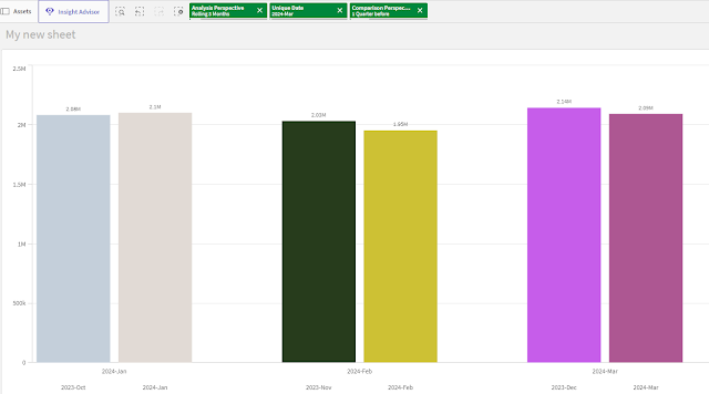
If your eyes are good enough, you might notice a new field "Comparison Group" is introduced in the ANALYTICAL_CALENDAR table.  It is a new function for comparison visualization.   To understand it, let use an example.   For instance, the selection of the 3 core fields are:
  • Analysis Perspective (Rolling 3 months)
  • Unique Date (2024-Mar)
  • Comparison Perspective (1 Quarter before)
For KPI, it is easy to compare the total of 2024-Jan to 2024-Mar and 2023-Oct to 2023-Dec.  If it wants to break down into detail to compare each individual period inside the period, it might not be possible .  The comparison group is, thus, created to group these comparison requirements into groups.  Below illustrate an example.


The analysis period 2024-Jan to 2024-Mar has three individual year month including 2024-Jan, 2024-Feb and 2024-Mar while the comparison period has individual year month including 2023-Oct, 2023-Nov and 2023-Dec.  The comparison group helps to group these period together.   As a result, you are able to compare in detail which year month is performing good or bad inside the analysis and comparison period.

The comparison group is still exploring for more visualization capability.  Apparently, it is very useful for a bar chart to compare across the periods to identify which works great and which works badly.


Thank you for reading.  I hope it help you.  Just leave a message if you have any discussion/share want to make.

Saturday, June 22, 2024

Qlik Sense Financial Reporting Extension

 Post Index  

2024-06-22


Qlik Sense Financial Reporting Extension

Customizing Table for Reporting Purpose

Using Qlik Sense Extension to customize Standard Report Layout


----------------------------------------------------------------------------------------------------------

Side Track

It was some time ago that I posted articles into different communities.   Now, I am trying to consolidate back all of my shared articles into my blog for easy reference.  Also, I will also review a bit of them and see if any new information to supplement.   As time goes, everything keeps changing.  In particular to technology, in most of the time, we can see a lot of old stuff to be depreciated and come with new ideas, tools, etc.  Let's ride on them and move forward!  Let's stay tuned and updated!

----------------------------------------------------------------------------------------------------------


Qlik Sense Financial Reporting Extension

This extension is my first Qlik Sense extension.  It was, in fact, previously achieved the same using QlikView.  Due to the wave to migrate QV to QS, the method done in QV is no longer possible to be applied in QS.  The only way is to make an extension to do it.

At first, I tried this because of curiosity.  However, later I found it very useful because it let me to have a deeper knowledge in QS and also got more familiar a lot of things in QS that were behind the scene.  Now, I revisit the post and share it again.  I do not think it is good to share the extension because it is a bit out of date and I don't see a big demand in using this (at least, not many people approach me and ask about this recent years).   Below is the original post.

https://community.qlik.com/t5/Integration-Extension-APIs/Financial-Reporting-Extension/m-p/1952079


Below is the content of the original post for reference.

=======================================================================

Financial Reporting Extension

Topic

Financial reports is actually a table with specific format. And each of the line is calculated from some accounts with some specific attribute filters. In QlikView, the frontend requirement is able to be achieved by customizing the straight table. And backend, it is also able to be achieved by associating the right amount to each of the reporting line. However, in Qlik Sense, because of its simplicity, it is no longer available. It is impossible to customize the table like cell border, font bold, font size, etc. While the world is migrating QlikView to Qlik Sense, it is still necessary for financial reporting.

Therefore, the only way to achieve this is to make use an extension to allow the reporting customization. The backend is still can still be the same to make use of the association.

Financial Reporting

Very Simple Sample

financial.png

Settings Sample 1

header.png

Settings Sample 2

cell.png


Keep Connected

Drop me a message for discussion and sharing if you find this interesting and useful.

=======================================================================


Qlik Sense Extension

Before ending this post, I would like to highlight a bit on using Qlik Sense Extension.  Extension is handy and easy to use and apply but in general, it is risky.   One typical issue is that it might be incompatible in future releases and often, it would not get an upgrade.  Also maintaining an extension is time-consuming.  Whenever there is a patch release or new version, regression test is needed.   Unless the extension is highly dependent, otherwise, it would not get enough resources to support it.   Being said, extension is still good to apply because the basic charts cannot offer.  In short, I would recommend you to try the basic charts, customize the basic charts first before thinking of an extension solution.


By the way, my extension is not the same the PNL table from Qlik Visualization bundle.  It is actually a free style HTML table allow you to customize each line.  Definitely, it requires a QS model to maximize its usage.  I will try to cover more about this later as the generic model design should be shared and learnt.


Thank you for reading.  I hope it help you.  Just leave a message if you have any discussion/share want to make.

Saturday, June 15, 2024

Qlik SaaS Audit Log Application

 Post Index  

2024-06-15


Qlik SaaS Audit Log Application

Monitoring Qlik SaaS

Consolidating the logs information for easy tracking and tracing


----------------------------------------------------------------------------------------------------------

Side Track

It was some time ago that I posted articles into different communities.   Now, I am trying to consolidate back all of my shared articles into my blog for easy reference.  Also, I will also review a bit of them and see if any new information to supplement.   As time goes, everything keeps changing.  In particular to technology, in most of the time, we can see a lot of old stuff to be depreciated and come with new ideas, tools, etc.  Let's ride on them and move forward!  Let's stay tuned and updated!

----------------------------------------------------------------------------------------------------------


Qlik SaaS Audit Log Application

Back to this post content, "Qlik SaaS Audit Log Application" is one of my first few community posts in my life.  The post has been, in fact, posted for already two years.  Suddenly one day, I got a reply and a message to ask for the application.   I revisit the post as well as the application and decide to take some time to clean up and share the application.  The concepts and roughly the ideas how to implement the application can be found in the original post below.

https://community.qlik.com/t5/Qlik-Cloud-Data-Integration/Qlik-SaaS-Audit-Logs-Application/m-p/1941012

Below is the content of the original post for reference.

=======================================================================

Qlik SaaS Audit Logs Application

Topic
In Qlik SaaS, there is very limited event information you can find through the management console. The only way to get the full picture of logging is to call API (i.e. GET /audits/archive) to capture the relevant information. The information returned depends on what logs are available and it might take a while to understand and to parse the information.  Some data transformation is needed to make the information meaningful and visible.

I have tried to create a Qlik Sense application that calls the API and transform all information into a single data model.

audit_log.png


Qlik SaaS Aduit Logs Application
The below information has been extracted:
- User Log
- Space Log
- Space Assignment Log
- User Session
- App Reload
- App Load
- App Table Export Log
- App Export Log
- App Object Log
- App Publish Log
- App Data Updated Log
- License Assignment Log

archive.png

example.png

Keep Connected
Drop me a message for discussion and sharing if you find this interesting and useful.


=======================================================================


Github Share Link


The Qlik SaaS Audit Application is now placed in my github.  If you are interested, you can find in

https://github.com/kongson-cheung/qlik-saas-application/blob/a5d19c8cdcf7732357ef3aeac6313f351c79885e/Qlik%20SaaS%20Audit%20Logs%20(template%20developed%20by%20Dr.%20Kongson%20Cheung).qvf


Thank you for reading.  I hope it help you.  Just leave a message if you have any discussion/share want to make.